Perfect 3 Column Liquid Layout
Percentage dimensions of this layout
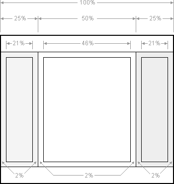
All the dimensions are in percentage widths so the layout adjusts to any screen resolution. Vertical dimensions are not set so they stretch to the height of the content.
Maximum column content widths
To prevent wide content (like long URLs) from destroying the layout (long content can make the page scroll horizontally) the column content divs are set to overflow:hidden. This chops off any content that is wider than the div. Because of this, it's important to know the maximum widths allowable at common screen resolutions. For example, if you choose 800 x 600 pixels as your minimum compatible resolution what is the widest image that can be safely added to each column before it gets chopped off? Here are the figures:
- 800 x 600
- Left & right columns: 162 pixels
- Center page: 357 pixels
- 1024 x 768
- Left & right columns: 210 pixels
- Center page: 459 pixels
The nested div structure
I've colour coded each div so it's easy to see:
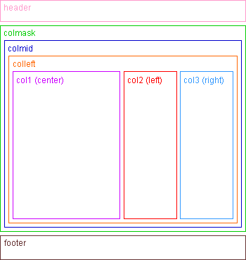
The header, colmask and footer divs are 100% wide and stacked vertically one after the other. Colmid is inside colmask and colleft is inside colmid. The three column content divs (col1, col2 & col3) are inside colleft. Notice that the main content column (col1) comes before the other columns.
No CSS hacks
The CSS used for this layout is 100% valid and hack free. To overcome Internet Explorer's broken box model, no horizontal padding or margins are used in conjunction with a width. Instead, this design uses percentage widths and clever relative positioning.
SEO friendly 2-1-3 column ordering
The higher up content is in your page code, the more important it is considered by search engine algorithms. To make your website as optimised as possible, your main page content must come before the side columns. This layout does exactly that: The center page comes first, then the left column and finally the right column (see the nested div structure diagram for more info). The columns can also be configured to any other order if required.
Full length column background colours
In this layout the background colours of each column will always stretch to the length of the longest column. This feature was traditionally only available with table based layouts but now with a little CSS trickery we can do exactly the same with divs. Say goodbye to annoying short columns!
No Images
This layout requires no images. Many CSS website designs need images to colour in the column backgrounds but that is not necessary with this design. Why enlarge your Carbon-footprint or waste bandwidth and precious HTTP requests when you can do everything in pure CSS and XHTML?
No JavaScript
JavaScript is not required. Some website layouts rely on JavaScript hacks to resize divs and force elements into place but you won't see any of that nonsense here.
Resizable text compatible
This layout is fully compatible with resizable text. Resizable text is important for web accessibility. People who are vision impaired can make the text larger so it's easier for them to read. It is becoming increasingly more important to make your website resizable text compatible because people are expecting higher levels of web accessibility. Apple have made resizing the text on a website simple with the pinch gesture on their multi-touch trackpad. Is your website text-resizing compatible?
No Quirks Mode
This liquid layout does not require the XML declaration for it to display correctly in older versions of Internet Explorer. This version works without it and is thus never in quirks mode.
No IE Conditional Comments
Only one stylesheet is used with this layout This means that IE conditional comments are not needed to set extra CSS rules for older versions of Internet Explorer.
Browser Compatibility
This 3 column liquid Layout has been successfully tested on the following browsers:
W3C
- Amaya
Apple iPhone & iPod Touch
- Safari
Apple Macintosh
- Safari
- Firefox
- Opera 9.25 & 10.10
- Netscape 9.0.0.5 & 7.1
Ubuntu
- Firefox
- Opera 10.10
Symbian
- Opera Mini 4.2.14912
Windows
- Firefox 1.5, 2 & 3
- Safari
- Opera 8.1 & 9
- Google Chrome
- Explorer 5.5, 6 & 7
- Netscape 8
Valid XHTML strict markup
The HTML in this layout validates as XHTML 1.0 strict and supports CSS 2.1 (experimenting with CSS3 and adding jqueryui-features).
About
Accessibility
This website emphasizes on..., etc.
The site is build on XHTML/CSS by-, and regularly visited by visually handicapped, partially sighted and blind visitors.
The power of the Web is in its universality. Access by everyone regardless of disability is an essential aspect.
Tim Berners-Lee, W3C Director and inventor of the World Wide Web
Links
Accessibility
Stichting Waarmerk drempelvrij.nl
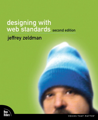
Designing with Web Standards
W3C
The World Wide Web Consortium (W3C)
Online tools for webdesigners
Browsers
Download
This layout is FREE for anyone to use
That's right, you don't have to pay anything. If you are feeling generous however, link back to this page so other people can find and use this layout too.
Download this layout (25kb zip file).


Dialog
XHTML & CSS
Compatible webdesign
v.s.
Creative webdesign with web standards
Designing with Web Standards, 2nd edition:
If your site were a movie, (X)HTML would be the screenwriter, CSS the art director, scripting languages would be the special effects, and the DOM would be the director who oversees the entire production.
Webstandaarden zijn niet een collectie absolute wetten, maar een pad vol mogelijkheden en beslissingen
Jeffrey Zeldman
The Web is fundamentally designed to work for all people, whatever their hardware, software, language, culture, location, or physical or mental ability. When the Web meets this goal, it is accessible to people with a diverse range of hearing, movement, sight, and cognitive ability.
Thus the impact of disability is radically changed on the Web because the Web removes barriers to communication and interaction that many people face in the physical world. However, when websites, web technologies, or web tools are badly designed, they can create barriers that exclude people from using the Web.
The mission of the Web Accessibility Initiative (WAI) is to lead the Web to its full potential to be accessible, enabling people with disabilities to participate equally on the Web.
Read more
The Netherlands
European Union
